CSS特效---华为手机充电特效;兼容各大浏览器
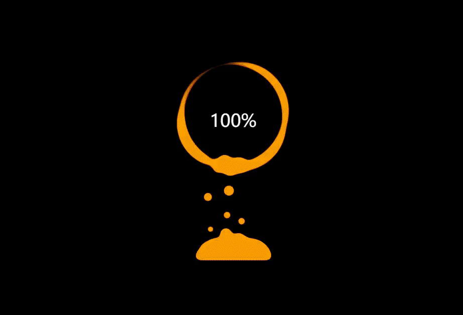
1、演示
2、一切尽在代码中
<!DOCTYPE html>
<html lang="en">
  <head>
    <meta charset="UTF-8" />
    <meta http-equiv="X-UA-Compatible" content="IE=edge" />
    <meta name="viewport" content="width=device-width, initial-scale=1.0" />
    <title>Document</title>
    <style>
      html,
      body {
        width: 100%;
        height: 100%;
        display: flex;
        background-color: #000;
        overflow: hidden;
      }

      @property --num {
        syntax: '<integer>';
        initial-value: 0;
        inherits: false;
      }

      .g-number {
        position: absolute;
        width: 300px;
        top: 27%;
        text-align: center;
        font-size: 32px;
        z-index: 10;
        color: #fff;
      }

      .g-container {
        position: relative;
        height: 400px;
        width: 300px;
        margin: auto;
      }

      .g-contrast {
        filter: contrast(10) hue-rotate(0);
        width: 300px;
        height: 400px;
        background-color: #000;
        overflow: hidden;
        -webkit-animation: hueRotate 10s infinite linear;
        animation: hueRotate 10s infinite linear;
      }

      .g-circle {
        position: relative;
        width: 300px;
        height: 300px;
        box-sizing: border-box;
        filter: blur(8px);
      }
      .g-circle::before {
        content: '';
        position: absolute;
        width: 176px;
        height: 176px;
        top: 40%;
        left: 50%;
        transform: translate(-50%, -50%);
        border-radius: 50%;
        background-color: #000;
        z-index: 10;
      }
      .g-circle::after {
        content: '';
        position: absolute;
        width: 200px;
        height: 200px;
        top: 40%;
        left: 50%;
        transform: translate(-50%, -50%) rotate(0);
        border-radius: 42% 38% 62% 49%/45%;
        background-color: #00ff6f;
        -webkit-animation: rotate 10s infinite linear;
        animation: rotate 10s infinite linear;
      }

      .g-bubbles {
        position: absolute;
        left: 50%;
        bottom: 0;
        width: 100px;
        height: 40px;
        transform: translate(-50%, 0);
        border-radius: 100px 100px 0 0;
        background: #00ff6f;
        filter: blur(6px);
      }

      li {
        position: absolute;
        border-radius: 50%;
        background-color: #00ff6f;
      }

      li:nth-child(0) {
        left: 56px;
        width: 28px;
        height: 28px;
        top: 50%;
        transform: translate(-50%, -50%);
        -webkit-animation: moveToTop 7s ease-in-out -1.433s infinite;
        animation: moveToTop 7s ease-in-out -1.433s infinite;
      }

      li:nth-child(1) {
        left: 21px;
        width: 23px;
        height: 23px;
        top: 50%;
        transform: translate(-50%, -50%);
        -webkit-animation: moveToTop 7s ease-in-out -3.484s infinite;
        animation: moveToTop 7s ease-in-out -3.484s infinite;
      }

      li:nth-child(2) {
        left: 65px;
        width: 21px;
        height: 21px;
        top: 50%;
        transform: translate(-50%, -50%);
        -webkit-animation: moveToTop 5s ease-in-out -2.673s infinite;
        animation: moveToTop 5s ease-in-out -2.673s infinite;
      }

      li:nth-child(3) {
        left: 24px;
        width: 19px;
        height: 19px;
        top: 50%;
        transform: translate(-50%, -50%);
        -webkit-animation: moveToTop 4s ease-in-out -4.448s infinite;
        animation: moveToTop 4s ease-in-out -4.448s infinite;
      }

      li:nth-child(4) {
        left: 41px;
        width: 17px;
        height: 17px;
        top: 50%;
        transform: translate(-50%, -50%);
        -webkit-animation: moveToTop 8s ease-in-out -4.181s infinite;
        animation: moveToTop 8s ease-in-out -4.181s infinite;
      }

      li:nth-child(5) {
        left: 36px;
        width: 25px;
        height: 25px;
        top: 50%;
        transform: translate(-50%, -50%);
        -webkit-animation: moveToTop 7s ease-in-out -3.371s infinite;
        animation: moveToTop 7s ease-in-out -3.371s infinite;
      }

      li:nth-child(6) {
        left: 64px;
        width: 24px;
        height: 24px;
        top: 50%;
        transform: translate(-50%, -50%);
        -webkit-animation: moveToTop 6s ease-in-out -4.786s infinite;
        animation: moveToTop 6s ease-in-out -4.786s infinite;
      }

      li:nth-child(7) {
        left: 29px;
        width: 16px;
        height: 16px;
        top: 50%;
        transform: translate(-50%, -50%);
        -webkit-animation: moveToTop 5s ease-in-out -3.911s infinite;
        animation: moveToTop 5s ease-in-out -3.911s infinite;
      }

      li:nth-child(8) {
        left: 57px;
        width: 22px;
        height: 22px;
        top: 50%;
        transform: translate(-50%, -50%);
        -webkit-animation: moveToTop 4s ease-in-out -3.463s infinite;
        animation: moveToTop 4s ease-in-out -3.463s infinite;
      }

      li:nth-child(9) {
        left: 80px;
        width: 26px;
        height: 26px;
        top: 50%;
        transform: translate(-50%, -50%);
        -webkit-animation: moveToTop 4s ease-in-out -1.537s infinite;
        animation: moveToTop 4s ease-in-out -1.537s infinite;
      }

      li:nth-child(10) {
        left: 59px;
        width: 17px;
        height: 17px;
        top: 50%;
        transform: translate(-50%, -50%);
        -webkit-animation: moveToTop 4s ease-in-out -3.992s infinite;
        animation: moveToTop 4s ease-in-out -3.992s infinite;
      }

      li:nth-child(11) {
        left: 55px;
        width: 24px;
        height: 24px;
        top: 50%;
        transform: translate(-50%, -50%);
        -webkit-animation: moveToTop 5s ease-in-out -1.554s infinite;
        animation: moveToTop 5s ease-in-out -1.554s infinite;
      }

      li:nth-child(12) {
        left: 84px;
        width: 30px;
        height: 30px;
        top: 50%;
        transform: translate(-50%, -50%);
        -webkit-animation: moveToTop 9s ease-in-out -1.917s infinite;
        animation: moveToTop 9s ease-in-out -1.917s infinite;
      }

      li:nth-child(13) {
        left: 62px;
        width: 22px;
        height: 22px;
        top: 50%;
        transform: translate(-50%, -50%);
        -webkit-animation: moveToTop 6s ease-in-out -3.77s infinite;
        animation: moveToTop 6s ease-in-out -3.77s infinite;
      }

      li:nth-child(14) {
        left: 80px;
        width: 21px;
        height: 21px;
        top: 50%;
        transform: translate(-50%, -50%);
        -webkit-animation: moveToTop 8s ease-in-out -0.239s infinite;
        animation: moveToTop 8s ease-in-out -0.239s infinite;
      }

      li:nth-child(15) {
        left: 85px;
        width: 17px;
        height: 17px;
        top: 50%;
        transform: translate(-50%, -50%);
        -webkit-animation: moveToTop 6s ease-in-out -2.587s infinite;
        animation: moveToTop 6s ease-in-out -2.587s infinite;
      }

      @-webkit-keyframes rotate {
        50% {
          border-radius: 45%/42% 38% 58% 49%;
        }
        100% {
          transform: translate(-50%, -50%) rotate(720deg);
        }
      }

      @keyframes rotate {
        50% {
          border-radius: 45%/42% 38% 58% 49%;
        }
        100% {
          transform: translate(-50%, -50%) rotate(720deg);
        }
      }
      @-webkit-keyframes moveToTop {
        90% {
          opacity: 1;
        }
        100% {
          opacity: 0.1;
          transform: translate(-50%, -180px);
        }
      }
      @keyframes moveToTop {
        90% {
          opacity: 1;
        }
        100% {
          opacity: 0.1;
          transform: translate(-50%, -180px);
        }
      }
      @-webkit-keyframes hueRotate {
        100% {
          filter: contrast(15) hue-rotate(360deg);
        }
      }
      @keyframes hueRotate {
        100% {
          filter: contrast(15) hue-rotate(360deg);
        }
      } /*# sourceMappingURL=charging.css.map */
    </style>
  </head>
  <body>
    <div class="g-container">
      <div class="g-number">0%</div>
      <div class="g-contrast">
        <div class="g-circle"></div>
        <ul class="g-bubbles">
          <li></li>
          <li></li>
          <li></li>
          <li></li>
          <li></li>
          <li></li>
          <li></li>
          <li></li>
          <li></li>
          <li></li>
          <li></li>
          <li></li>
          <li></li>
          <li></li>
          <li></li>
          <li></li>
        </ul>
      </div>
    </div>
  </body>
  <script>
    const number = document.querySelector('.g-number')
    let num = 0
    let timer = null
    timer = setInterval(() => {
      num += 1
      if (num >= 100) clearInterval(timer)
      number.textContent = num + '%'
    }, 100)
  </script>
</html>
原文地址:https://blog.csdn.net/nibabaoo/article/details/137830241
免责声明:本站文章内容转载自网络资源,如本站内容侵犯了原著者的合法权益,可联系本站删除。更多内容请关注自学内容网(zxcms.com)!